


About
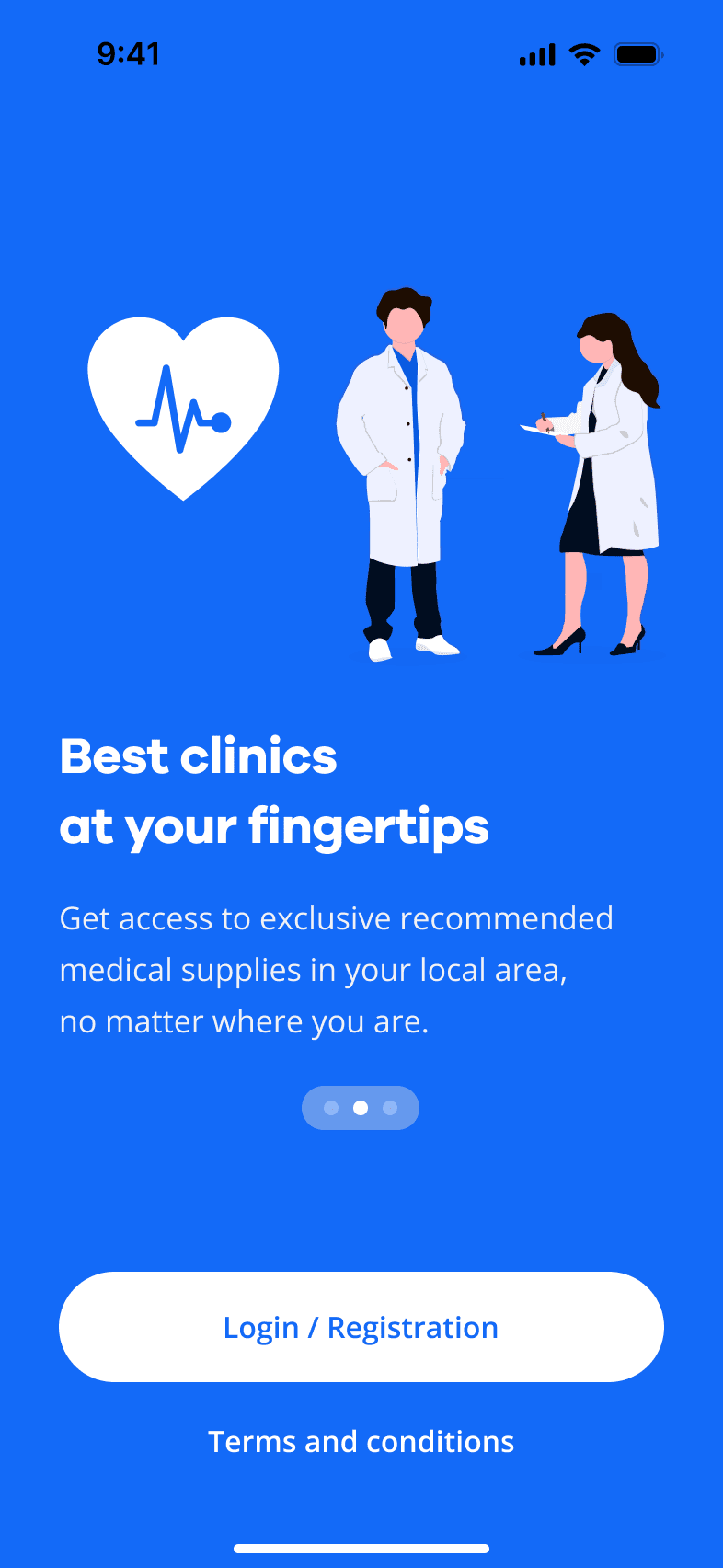
NDA company is a leading Ukrainian enterprise company in insurance, serving both businesses and individuals. In 2018, hey have launched a mobile app for health insurance services, in hopes to simplify experience.
Challenge
The client’s mobile app, launched in 2019, was receiving negative reviews and frustrating users despite thorough testing. When I joined the project as a UX Consultant, my goal was to pinpoint what users truly needed and design improvements that would not only enhance satisfaction but also boost conversion rates for the app’s key features.
Result
Raised customer satisfaction on 22% (from 66% to 88% in UMUX-Lite)
AppStore Reviews: from 3.9⭐️ to 4.9⭐️
Doctor appointment conversion: from 15% to 30%


Timeline
Jan 2022 - May 2023
My services
UX Strategy + Product-Market Fit Discovery
Workshops + User Interviews
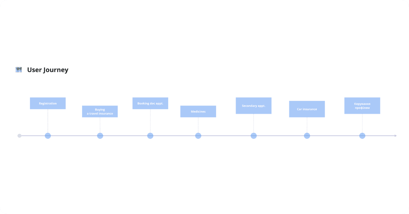
User Flows & CJM
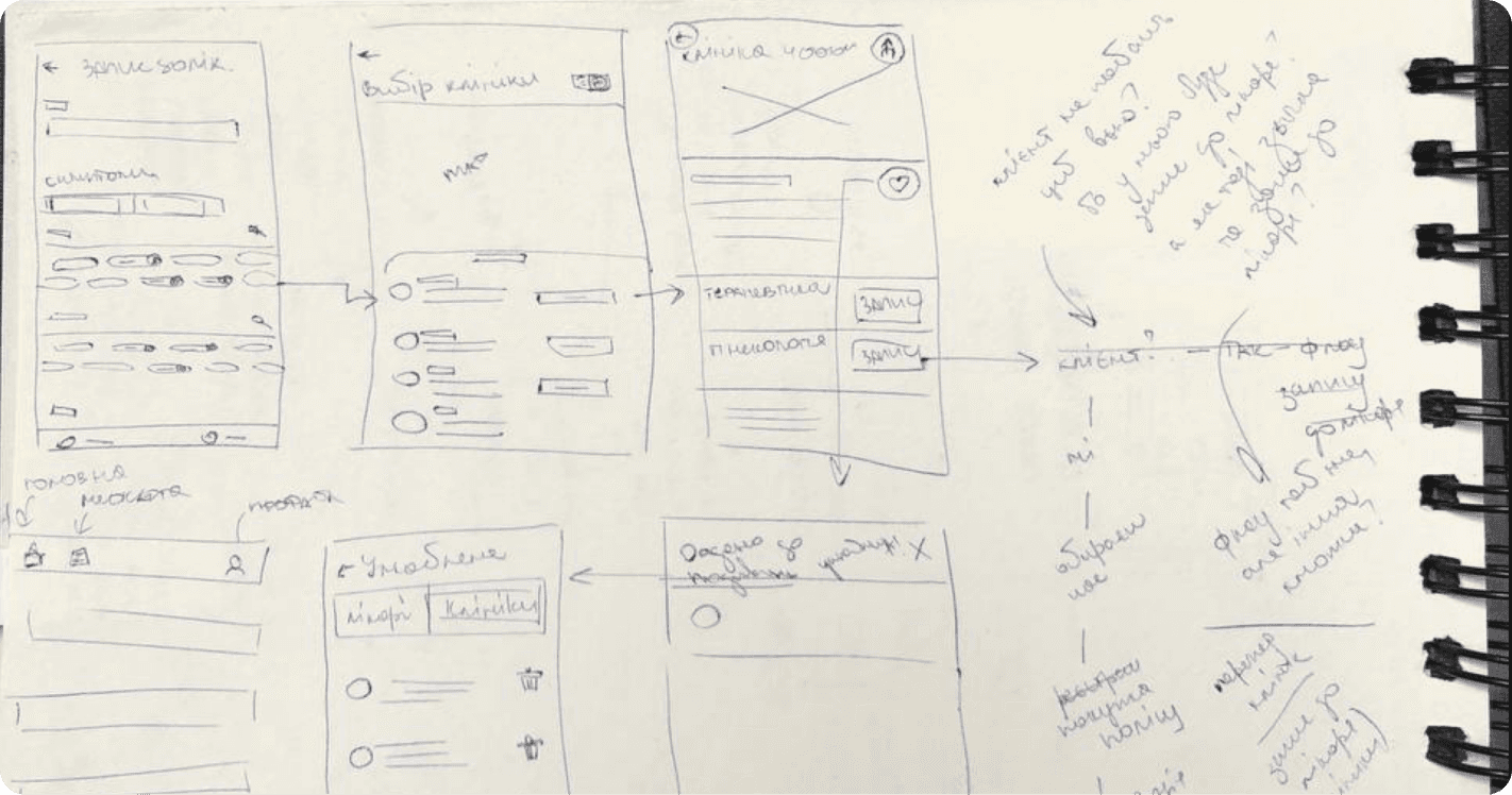
Wireframes + User Testing
Design System
Mockups & Interaction Design
Designing the solution…


starts from understanding the real problem.
PROJECT PLAN

PROBLEM STATEMENT
‘we have 3.9 ⭐️ in AppStore
and we don’t understand, why’
This is the exact request company leadership stated in meeting of 30 people, including me. It was my first time working with Ukrainian product company.
Customers overloaded hotline, causing delays in service primarily because the mobile app for booking appointments wasn’t usable.
Drag a handle to see both versions
AUDIENCE
Marianna and Vlad
Service quality > cost 🤓
After conducting 10 interviews with respondents from selected sample, I’ve gathered key pains and motivations of Marianna - our persona.
She is a 33-year-old project manager from Kyiv, values control, convenience, and transparency in healthcare for her and her child. Is cautious about new providers like the client’s company.

🌈 Hope
Easily book a quality healthcare service via insurance company
💀 Pain
Slow communication and difficulty of navigating the insurance mobile app.
🚧 Barrier
Complex account verification process, forms and lack of responsiveness.
Cost & speed > quality ⚡️
The key difference of Vlad from Marianna is his focus on receiving quick, stress-free assistance due to his limited insurance experience.

🌈 Hope
Quickly book an appointment and save money on healthcare costs
💀 Pain
Unclear processes and long wait times when dealing with insurance claims
🚧 Barrier
Lack of transparency and feedback from the insurance provider
OLENA HORBACHENKO


DESIGN BRIEF
HOW WE WILL GET THERE?
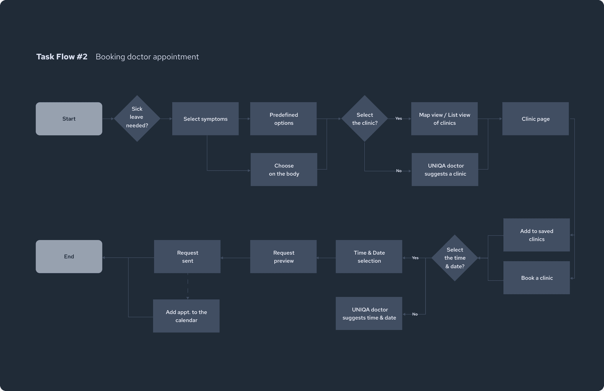
BREAKDOWN
2 core user flows done


PROBLEM STATEMENT
A seamless flow for new and recurring users
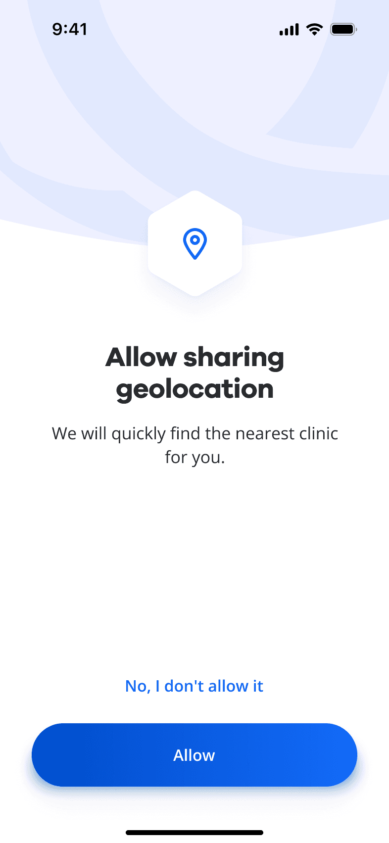
A key challenge with registration in mobile app was outdated UI look with input fields and texts that wasn’t passing threshold of accessibility, with complex steps that included filling personal sensitive info.
How could we reduce friction and cognitive load in the registration process?
🌈 Customer hope
Learn about insurance services, and file an insurance request.
🚧 Barrier
Request of sensitive data on early stage of exploring the app.
💀 Pain
Manual email and password creation, outdated look.


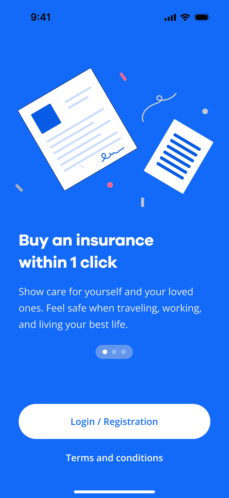
Simplified login
Forget finding legal documents to register. If you are our client, we have all the data, just make sure you remember your PIN.


USER TESTING
'It feels much easier now!'

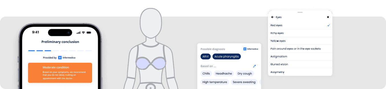
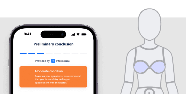
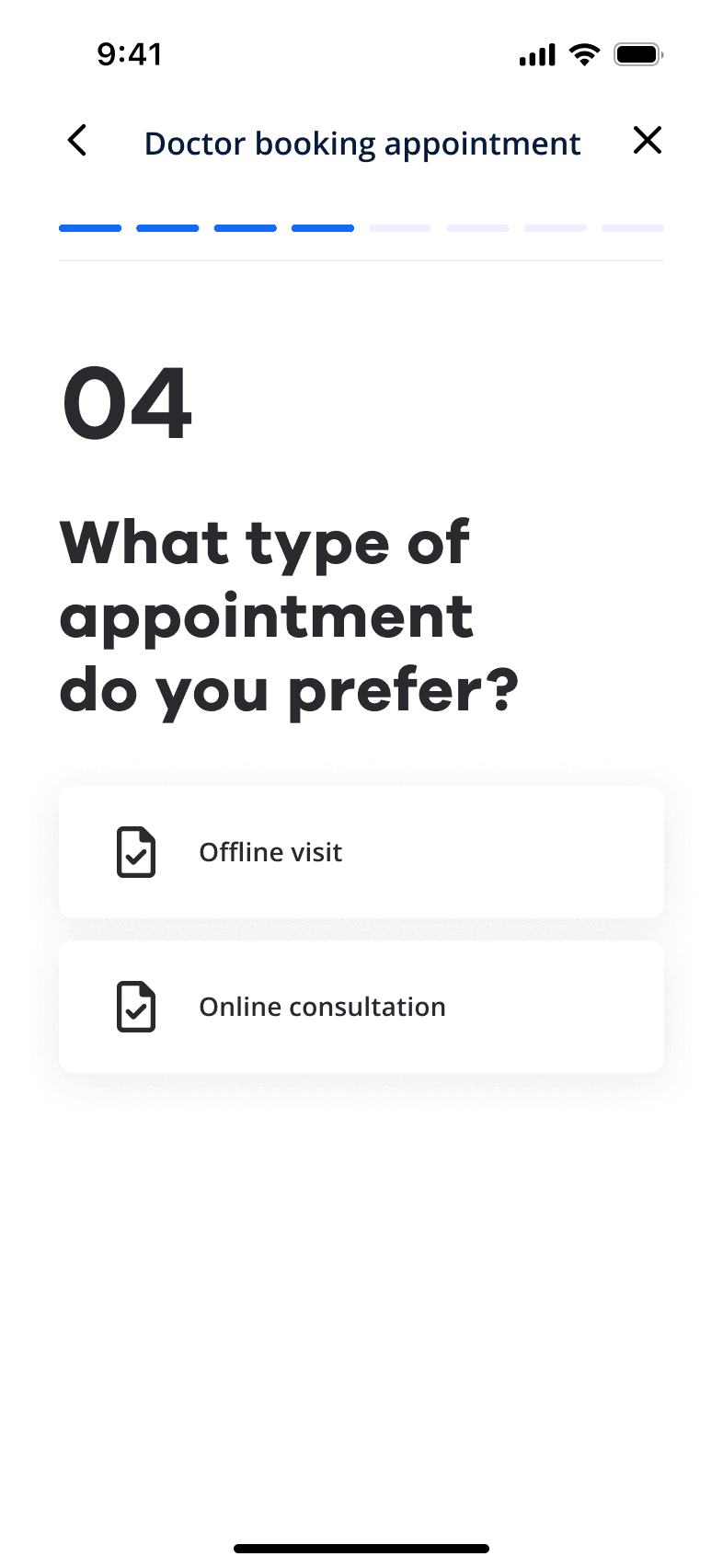
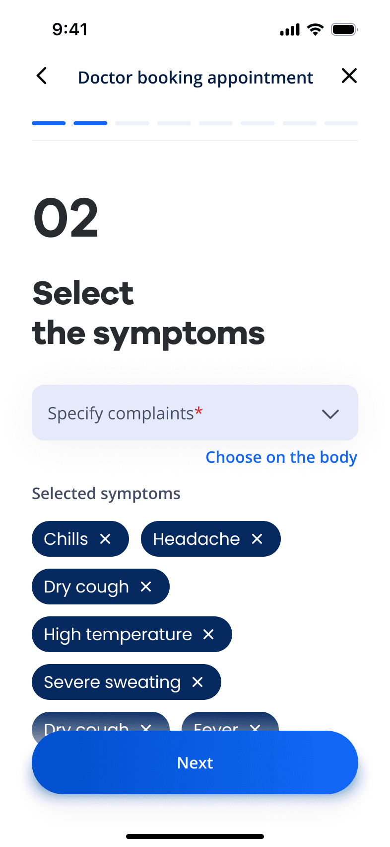
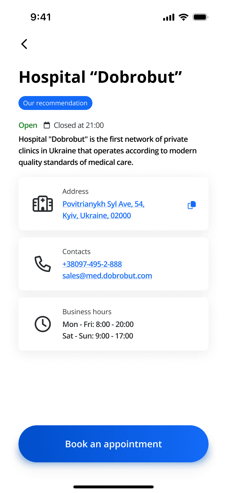
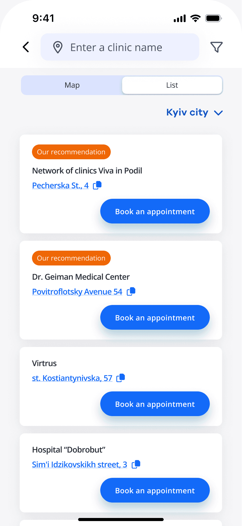
PROBLEM STATEMENT
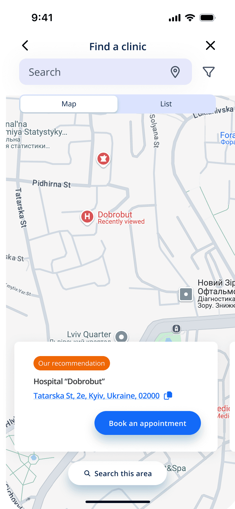
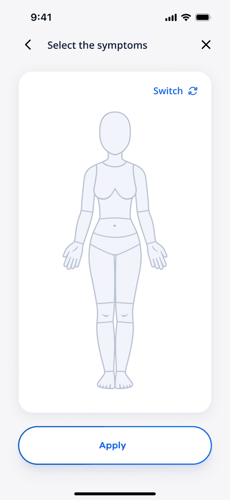
A bunch of freeform fields, lack of optimization for accessibility and tiring date and time selection - those were top 3 problems mentioned in reviews in AppStore and GooglePlay Market around doctor appointment booking flow in the mobile app.
🌈 Customer hope
Book a doctor appointment
without long waits on the hotline
🚧 Barrier
Complex form with 12+ fields and difficult to use UX patterns.
💀 Pain
No way to receive an insurance response directly in the app.
Drag a handle to see both versions

USER TESTING
CLIENT TESTIMONIAL
From UX analysis to ideation : what a journey!

REFLECTION
Key lessons for startup owners and enterprises 📕
A conversational tone significantly improves engagement. People buy
from people, and they sense formality.
RESULT
From 3.9 ⭐️ to 4.9 ⭐️ within the first month
First users highlighted that a new version of the app feels much more easy to use.